In the digital world, where every click counts, having an effective opt-in form can make all the difference for businesses.
We want to share with you essential strategies to optimize your forms. Here, you will discover practical tips that will help you increase your subscriptions and strengthen your relationship with your customers.
First of all, why should you create subscription forms?
In the digital age, connecting with your audience directly and effectively is essential. This is where subscription forms become protagonists. If it is well designed, it is more than a simple text box: it is the gateway for your users to valuable content, special offers, and direct communication with your brand. That’s why we give you these tips to create subscription forms that convert.
Using software to create subscription forms makes it easier to design and adapt these key elements to the specific needs of your business.
But beyond aesthetics, the importance lies in the ability of these forms to collect valuable information. Through them, you can segment your audience, offer personalized content, and ultimately drive conversions.
Opt-in forms, if used correctly, can be powerful tools in your digital marketing strategy. They facilitate interaction, strengthen engagement and, most importantly, create opportunities to grow and prosper in the competitive online world.
Five tips for creating effective conversion forms
Now that you know the importance of subscription forms, we are going to give you 5 tips to make them as effective as possible.
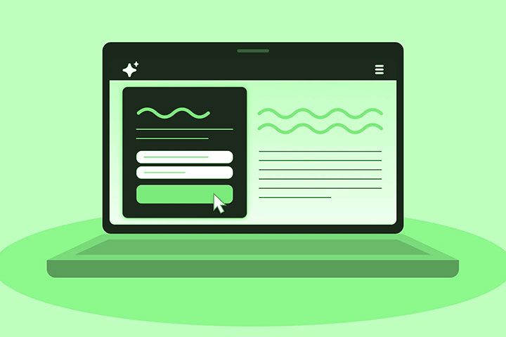
Keep the design simple and clean
In the digital sphere, a simple and clean design in contact forms stands as a haven of clarity. A clean design, without superfluous elements, allows the visitor to focus on the main task: completing and submitting the form.
By reducing visual distractions, such as unnecessary images or flashy colours, the user can focus on essential information. The simplicity of the design eliminates barriers, confusion and doubts that may arise when faced with a busy form.
Each element on the form should have a clear purpose. By keeping it simple, the user can navigate intuitively, which in turn encourages conversion. Because in the end, if the process is straightforward, the visitor is more likely to become a valuable contact for your business.
Also Read: Top 5 Elements That You Can Implement For Web Optimization
Request only essential information
Nobody wants to spend minutes filling out a long and tedious form. By requesting only essential information, you guarantee an agile process that is respectful of the user’s time. A concise state, which requires fewer fields to fill out, translates into a smoother experience for the visitor.
By only asking for what is essential, you send a clear message: you value your users’ privacy and time. This builds trust, as visitors know you’re not collecting unnecessary data.
Furthermore, if it is brief, it reduces the probability of abandonment. The less complicated and more direct the process, the greater the likelihood that the user will complete the desired Action.
Ensures user privacy
Users are increasingly aware of the importance of protecting their data. By ensuring user privacy, you demonstrate respect and responsibility for their data. This trust, forged between the user and your brand, directly translates into a greater willingness to share information.
If you feel safe and know that your information is protected, you are more likely to complete the form. Furthermore, offering privacy guarantees not only complies with regulations and laws but also highlights your ethical commitment. Transparency and commitment to privacy are factors that drive conversion.
If you are one of those companies that want to optimize this aspect and offer the best experience, request a demo of EasyMailing here.
Use a Call To Action
A call To Action is the bridge that connects the user’s intention with a specific action. It is the invitation to take one more step, whether to subscribe, download a resource or make a purchase. If it is clear and persuasive, it directs attention and motivates the user to interact with the content.
A compelling CTA captures interest, creates a sense of urgency, and removes any ambiguity about what Action should be taken next. As the ultimate guide for the user, a well-formulated Call to Action can be the deciding factor between conversion and abandonment.
Additionally, combining an attractive design with a direct and encouraging message creates an environment conducive to interaction.
Constantly test and optimize
The digital world is constantly changing and evolving, and what works today may not work tomorrow. Therefore, continually testing and optimizing a contact form is essential. Through evaluations, you can understand which elements of your formwork are best and which ones need adjustments.
A/B testing, for example, allows you to compare two different versions of a form to see which generates more conversions. This trial-and-error methodology gives invaluable insight into your users’ preferences and behaviours.
Optimizing based on actual data and direct feedback ensures that your form is always aligned with the needs and expectations of your audience.
Also Read: How To Sell On Facebook And Instagram – Guide To Opening The Store